Earlier this year I introduced an overhaul to this site, with the intention to update and refine both its visual style and role. It is now the central hub of all my contents, including blog posts and an about page currently, and many more planned for the future. Visual-wise I aimed to resemble the classic print newspaper style, in a modern fashion with great accessibility.
Updates
Blog
The blog is the main section of this site; over ninety percent of the contents are blog posts. Functionality-wise the writing part stayed most the same; the main changes were adding navigation components such as side panels, grid style archive list, and below content post link columns, with the intention to prevent unnecessary attention disturbance while reading, as well as providing good accessibility while navigating. Design-wise I tried to achieve the classic print newspaper look. This was more of a preference rather than a strategic decision.
About
The about page now can be easily accessed, as part of this site's contents. It was a separated entry hosted on a different subdomain than the blog; I figured making my contents centralized would help the rare guests who bumps into here traverse more easily. Design-wise it is mostly following the blog's design, I didn't do much dedicated work for it.
Stack
Tailwindcss is removed entirely from this site's stack. It was introduced as an efficient styling solution for a static blog site with minimum features, and it served that role alright, but with features that requires more complex styling planned in the future, that one layer of abstraction becomes liability while writing plain css becomes a faster and easier way for extensive styling.
Looking back I would say the introduction of tailwindcss was the right decision; it fulfilled its purpose of quick, simple styling, and through the usage I got to experience such class name based CSS-in-JS styling tools' pros and cons in first hand.
The styling solution now is CSS module. Other CSS-in-JS styling tools were considered, but the ability to write plain CSS for maximum customization capability and simpleness were the deciding factors. With this change it should be easier to develop features that require stylings that are more complex.
The journey
The idea of making my blog newspaper style emerged from late last year. It has always been the minimalist, low interactivity, black and white style; I reckoned that my favorable classic print poster / newspaper style would be a good fit on this site. The challenge of doing the whole site's visual design with a particular goal also seemed like to be a good UI and UX design practice session. So there goes the plan.
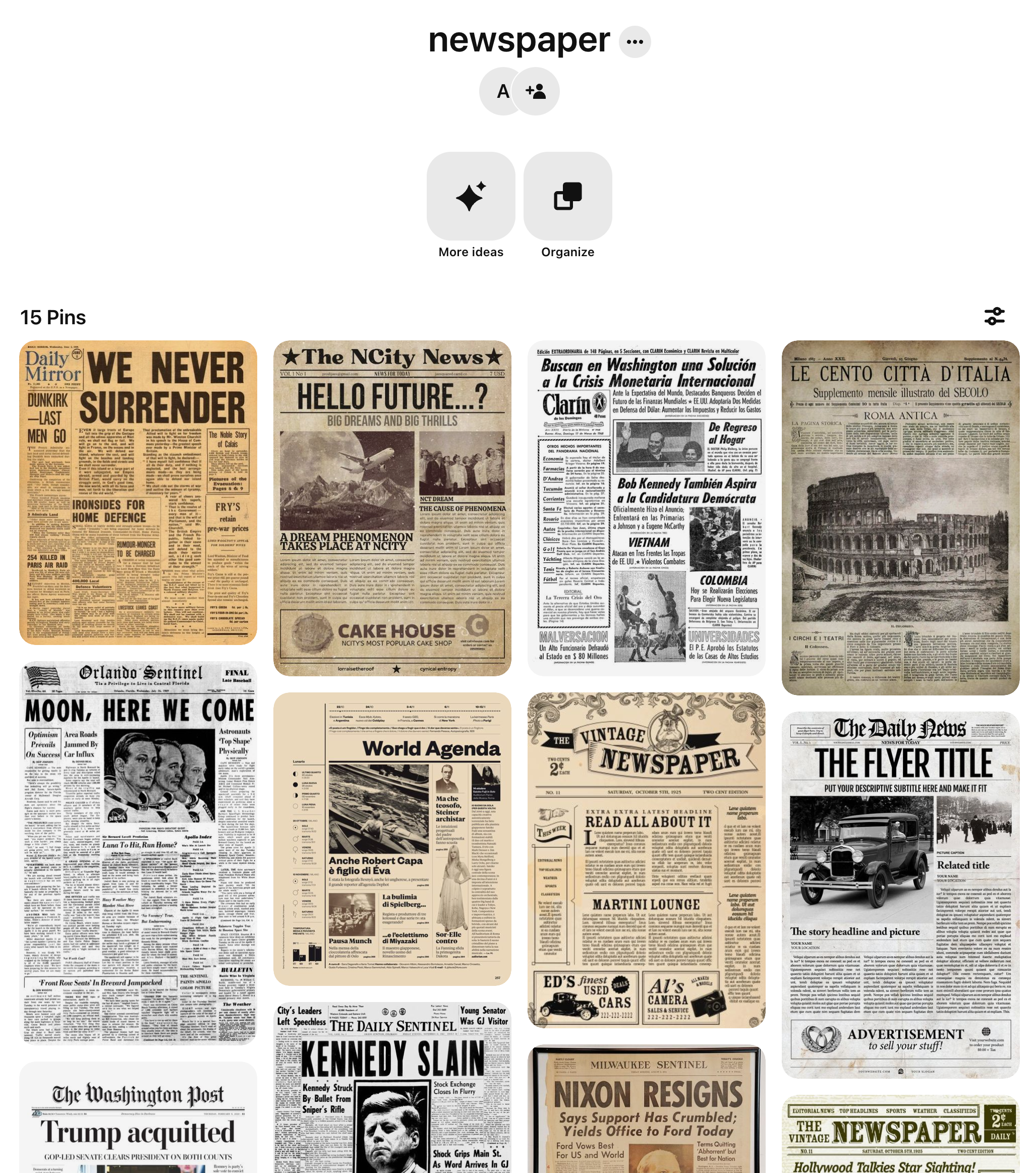
My first source of inspirations were Pinterest and other blogs that shares my ideal style. From them I managed to find some common parts that seemed suit my needs; but however I reordered those components with minor adjustments, wishing to bump into a good draft, they never felt right. I realized that blindly copying without understanding the fundamentals of a newspaper design would lead me nowhere.

So started the journey of looking for newspaper design guidance. Books about layout and typography become the top priority every time I see a book store. With that mission bore in my mind, however, I still struggled to find the "right" material on this topic. It seemed like the visual design of newspaper -- especially the ones with western classic print style -- was such a specific topic, it's hard to find a devoted resource about it -- at least in Japan.
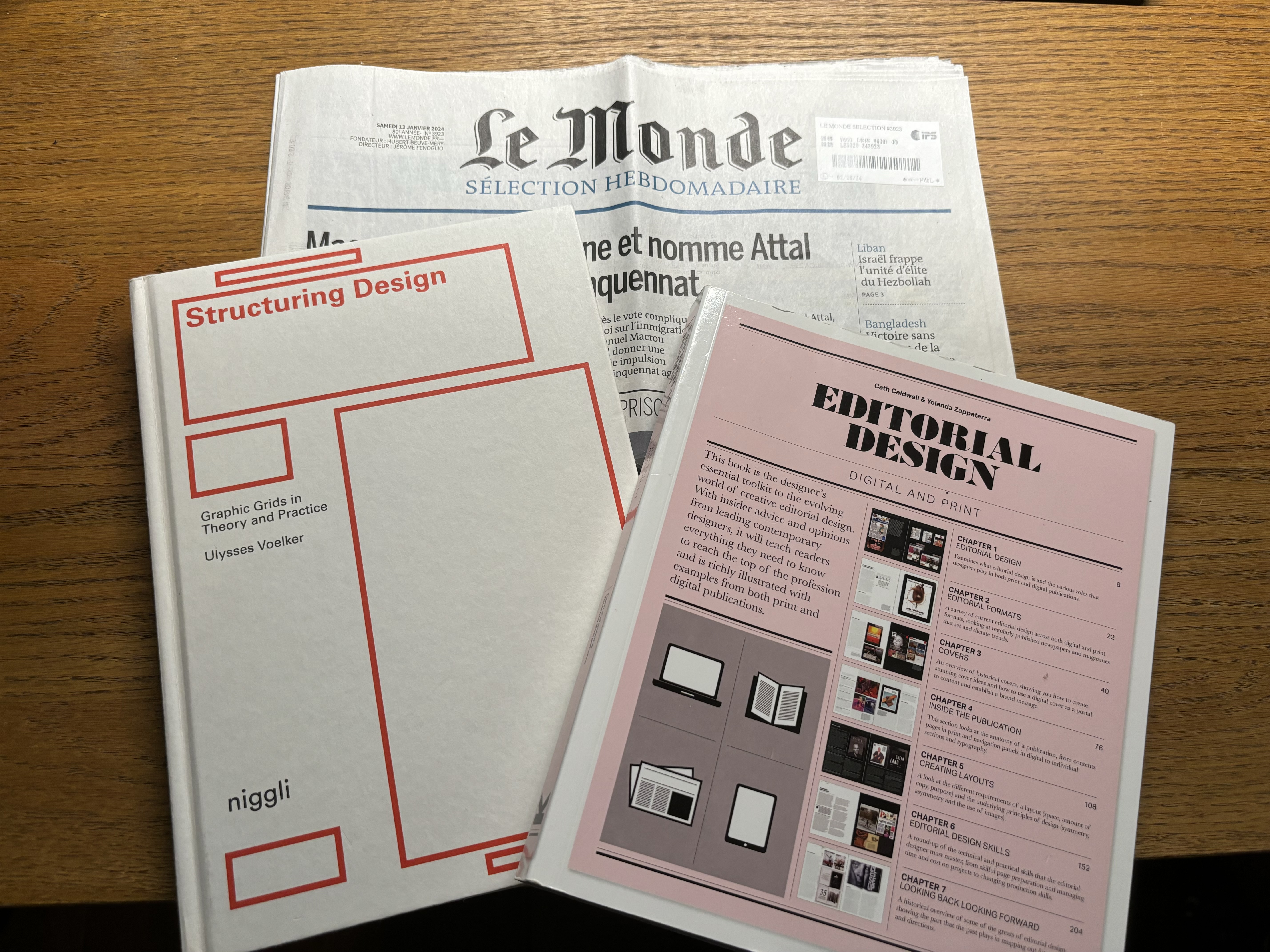
I managed to find Structuring Design: Graphic Grids in Theory and Practice in a foreign-book-only bookstore. While it is not dedicated about newspaper design, the knowledge of grid system, and design rules about publication still enlightened me greatly. The biggest lessons I learned from it were: design must be about the audience; and behind each design decision must be a particular reason.
With the help of Structuring Design I published the first version of the redesign in May. It was a huge leap from the previous one to my vision, but I was never satisfied with it. I felt I still didn't know anything about newspaper design, and every time I see the published result, the discords among each components, spacing and typography stood out, yelling for another revamp.
Weeks passed. Time was my trip to the United Kingdom, I had high hope on the bookstores there: if I were going to find any material that would help me from such situation, it would be in there. And praise his majesty, I did found it there.
It was in the the Design Museum shop I meet Editorial Design: Digital and Print. I didn't even realize the topic I should have search for was editorial design until this point. This book taught me the fundamentals about the design of publications, the principles and the components, the essential skills, and more. To be honest this book was pretty dry, I had to fight my way to the end; but it was the game changer I was searching for.

I quickly made a second redesign draft after reading it, implying the knowledges I gained from it. It is the design you are looking at right now. Honestly, I'm still not satisfied; some decisions are still in pending and compromises were made. Art is never finished, merely abandoned, after all. But I'm very happy about the progress; this is undoubtedly my best design work yet. And with the foundation laid in this redesign, I'm extremely excited about the work I get to do with it in the future.